5 Important Things to Know About Responsive Design
Responsive design is one of the most important features of any website. While it’s far from a new concept, it’s vastly misunderstood and its implementation leaves many website owners scratching their heads. It may be easy to understand that responsive design means that your website will display and function intuitively on any device but it’s important to know that it’s more than just looks. The functionality of your website depends on it, your SEO depends on it and your overall user experience depends on it.
First Some History
Responsive design is a result of the advent of mobile devices. The need for a sleek user experience was necessary when screens became smaller. Pinching and sliding to enlarge text and images was frustrating but people kept looking at their phones. Google wants every user experience to be flawless and useful, so in 2015 they released a new algorithm, Mobilegeddon, that incorporated mobile-friendly design into their ranking system. This forced anyone with a non-mobile-friendly website to scramble and create sites that were responsive to stay relevant in search results.
-
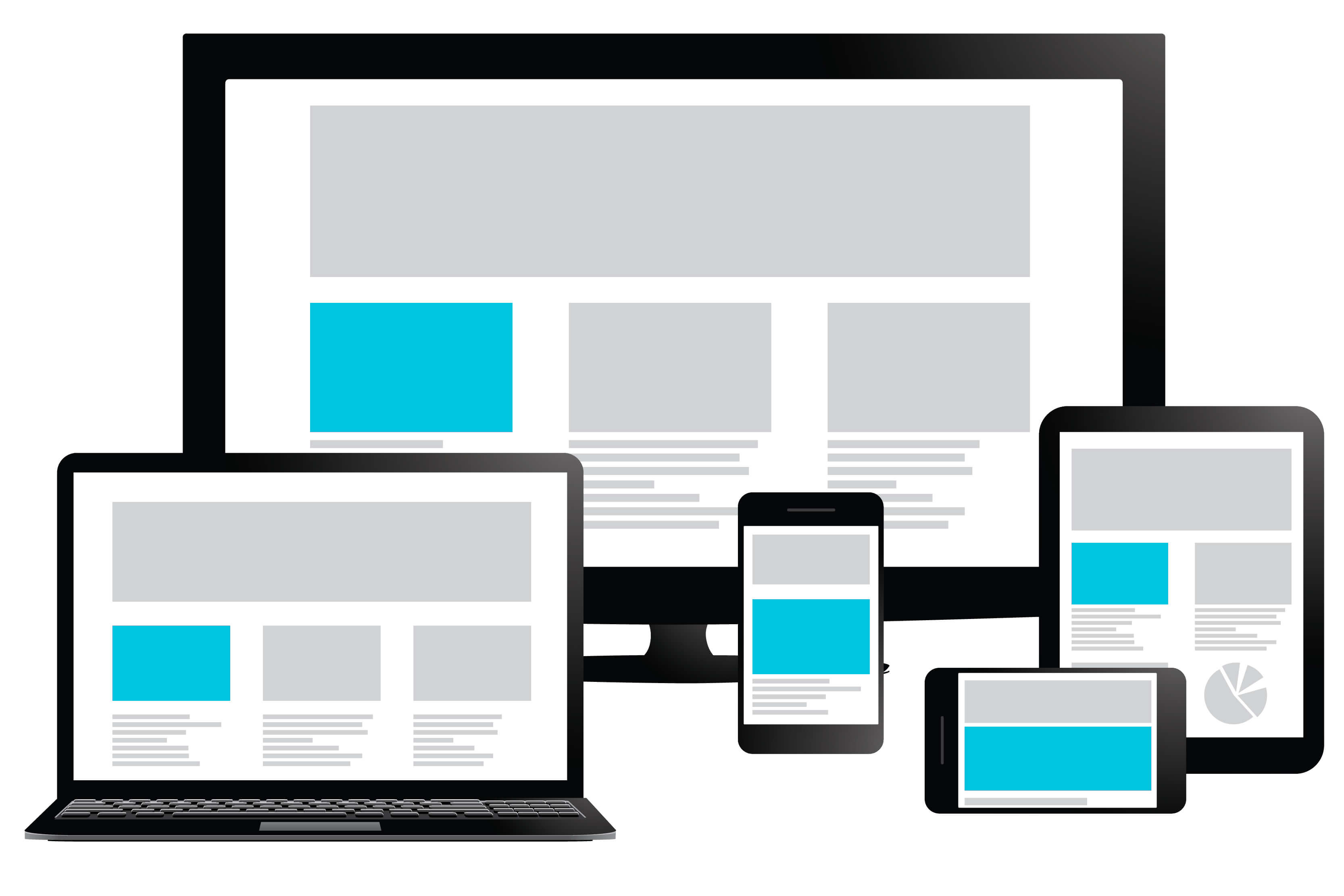
Responsive Design Ensures That All Your Content Will Display Correctly on Any Screen.
Responsive design is the space where developers and designers use their skills to create websites that will delight visitors and compel conversions. By visualizing what users will see based on their screen size, effective designers problem solve and figure out where breakpoints will be and how to directly influence logical website navigation. Serving the most important information first and seamlessly leading them through the site is extremely important for user experience. For a site to be responsive it must be designed on a grid. When the screen shrinks, the grid shuffles, rearranging the content. Even when the screen changes orientation, the grid still provides a positive user experience. Designers must ensure that the site looks appealing on every screen as the developers ensure that the site functions properly on every size of screen.
“You have to organize, problem solve and make things fit. You have to see what works and what is extra. Get rid of the extra and maximize what’s working. Strip it down. This creates a logical, intuitive user experience which makes for a good website.” – Chad Bianco, Lead Graphic Designer

2. Lack of Responsive Design will Negatively Affect your SEO Rank
Since the “Mobilegeddon” algorithm update in 2015, Google has been working to make user experience the pinnacle of their platform. Indexing sites that were responsive or mobile friendly with a higher rank has been rewarding businesses in the know. More than 80% of web traffic is driven by mobile devices. It’s no surprise that Google will want to serve sites that work better on mobile devices. Further, Google has publicly stated that they prefer a responsive site. The most important reason being that indexing one responsive site takes fewer resources than indexing desktop and mobile versions of the same site. Responsive sites save Google resources, reward you with rank credibility and delights your customers with logical, flawless design and functionality.
3. The End Goal of Responsive Design is a Wonderful User Experience
In some cases, the only computer a customer owns is a mobile device. And even those who own a desktop are likely surfing and searching on their mobile device. You want to give these users everything they need to interact with your website when you’re in their hand. Including analytic data into your site planning is fundamental in responsive design. If you can understand how your users interact with your site, you can design and develop appropriately to provide them everything they need to make a conversion. If your services are more complex, a great mobile experience can compel the user to move from mobile to desktop. Responsive design ensures that the transition is harmonious, that the user can jump from screen to screen without losing functionality or ever experience difficulty navigating your site.

4. The Interaction with Your Site on Mobile Will be Vastly Different Than on Desktop
What works on mobile doesn’t always transition to desktop. Understanding this is the key to understanding responsive design. On a mobile device, users prefer to scroll, to tap and to be lead with little effort to their destination. They don’t wish to type long responses or fill out lengthy forms. It’s important to keep that in mind when designing your responsive site. You will undoubtedly need these types of conversions on your site, but they may be hidden on mobile. This is where analytics first, design second really comes in. Understanding how users interact with your site on desktop vs. mobile will dramatically affect the design and functionality. The beauty of responsive design is that you can have both and if you design it properly users will understand when and why to transition from mobile to desktop and won’t hesitate to do so.
5. There are Rules When it Comes to Responsive Design
One of the most common misunderstandings about responsive design is that anything is possible. When you’re designing and developing on a grid there are strict rules. A responsive site is not a brochure, it is a constantly moving entity that must conform to the space it occupies. Images and certain types of graphics need to be served at different sizes to accommodate all screen sizes. Similarly, design cannot be forced to fit a screen. Some features of your website will not be able to be viewed correctly on mobile but a great designer will be able to come up with a congruous solution that looks beautiful nonetheless. Understanding that your website may not look exactly the same on mobile as it does on a desktop is important.
Responsive design isn’t a suggestion anymore. It’s a necessity. Understanding its purpose is key to creating a successful website that works for you. Responsive websites are logical, beautiful, functional and provide an intuitive user experience that helps to promote your brand and grow your business.